Sniff and propose, don’t impose
By Edouard on 25 février 2010
Two weeks ago I soft-launched the french version of Web Translate It, you can visit at webtranslateit.com/fr.
While working on it, I remembered a nifty technique used to propose a localised version of a website to the user. I really like this technique and I thought I should share it here.
There are usually two different techniques to serve a localized version of your service to your users.
IP sniffing
The first is a redirection based on IP sniffing, used notably by Google. I don’t really like this solution, because if you browse google.com from Japan, you will get the website in Japanese, which is not so great if you don’t know any Japanese.
It breaks the assumption that one URL equals one website, and not different sites depending on where you are, but it also makes the service unusable to people travelling abroad.
Web browser sniffing
A better solution is browser sniffing. It is about reading a list of preferred languages from the headers sent by the web browser.
Many services use this to redirect you to their available localised services. This is a really good solution, used notably by Facebook.
There is just one downside, though: it is a bit too magical for the end-user. Nobody knows about this browser language preference and many people think this automatic redirection is a bug. Most users don’t understand why a such redirection happens.
Sniff and propose, but don’t impose
So I rediscovered (1) another technique using browser sniffing to propose the user a localised version. I think this is the right way to go and it won’t pester anyone.
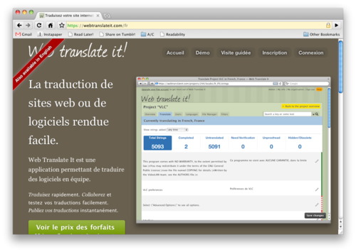
If a French user browse Web Translate It in English, she will see a clickable ribbon in the corner saying “Hey! Web Translate It is also available in French!” in French.

When the user clicks the ribbon, it sends her to the French version of Web Translate It.
Now this is what a user with browser settings set to something else than French will see when browsing the french version of Web Translate It:

This is easily extendable. If a russian version was available and a russian user browse the French site, a russian ribbon would propose her to browse the russian website.
I am really happy with this solution, and it is also a bit simpler to implement than the other solutions. Sure, it is one extra step to the user, but it is a step that makes people actually understand what is going on. One more click, much less confusion.
[1] The first and only time I saw it was when Last.fm launched its international sites. When browsing Last.fm with a French web-browser, a frame saying “Your browser speaks French. Do you?” was appearing. As far as I remember, it was really much appreciated by the users. ↩