I only write a blog post when I release important features to WebTranslateIt. There are actually quite a lot of changes released to the website everyday: bug fixes to the different linguistic file importers, internal changes, small user interface improvements, …
You can view WebTranslateIt’s changelog at this address: http://changelog.webtranslateit.com
Strings sometimes contain quite a lot of untranslatable content. URLs, HTML tags, code… For translators, translating these strings really are a pain, because the content is not translatable, but there also shouldn’t be any mistakes while retyping it.
I just released an update that should make translating strings containing untranslatable content more fun. Let’s have a look at how it works.
Let’s consider this string. It contains quite a lot of code.

Open the string’s form. It makes code clickable.

Click on the code and it will be pasted to the translation box. It’s that easy!

Here’s a quick video showing how this feature works
I hope you will find this improvement useful. Thank you for using WebTranslateIt!
I just released an important update to WebTranslateIt’s API.
The focus of this update is to give you full control on your strings and translations. The update adds 8 new endpoints:
The File API gets a new Delete File endpoint, to delete a master language file.
The Locale API gets a new Delete Locale endpoint, to delete a locale from a project.
We now have a new String API, which allows you to get, create, update and delete strings. I’ll add shortly a new endpoint to search for strings using parameters.
I also added a new Translation API to get and create translations for a string.
What can you do with this API?
Using this API, you can now translate virtually anything. For instance, you could create script translate fields from a database, mapping a field to a specific String, and retrieve their translations.
These new endpoints also enable developers to create a third-party desktop software to translate strings, using WebTranslateIt as a repository for translations.
I hope you will find this update useful. Thank you for using WebTranslateIt.
I just released a new version of the web_translate_it gem, the open-source synchronization tool for Web Translate It.
This release fixes several minor bugs. The web_translate_it gem now adheres to semantic versioning, which is why this release number is made of only 3 digits.
Install or Upgrade
To install web_translate_it, please refer to the gem documentation.
To upgrade web_translate_it to its latest version, type in a terminal: gem install web_translate_it.
WebTranslateIt now supports Babel Flash .xml files.
Babel Flash is a smart library to localize Flash projects. As its creator describes it:
Babel Flash is a free AS3 library whose goal is to make localizing your flash projects easier. It handles loading external font swfs and replace graphics and text on the fly. Setting it up can both be done programmatically or in the IDE, so it’s both programmer and artist friendly.
You can now localise these linguistic files using WebTranslateIt. We now support over 26 different linguistic file formats.
I just released another round of improvements to the translation memory server.
New ranking algorithm
The most important change is the matching algorithm. For the nitty-gritty details, the translation memory was previously using the BM25 algorithm. We now use another algorithm, which is a mix of BM25 with exact phrase matching. I’ve been using it for a few weeks now, and it gives much better results.
I also added the following tweaks:
Aberrations removal
The updated translation memory server removes aberrations. For instance, for a very short source string, you could get very long suggestions:

This is obviously not a good suggestion. The translation memory now reduces the weight to such suggestions and push the suggestion to the bottom of the list.

Pushing 100% matches to the top
The update translation memory server now improves the visibility of 100% Matches strings.
Here’s how a 100% Match was displayed before:

100% Match suggestions are now displayed more prominently and are separated from the other suggestions. You can still view the other suggestions by clicking on the “view xx suggestion” link.

I hope you will find these improvements useful. Thank you for using WebTranslateIt.
Today I am introducing WTIpress. WTIpress is a free Wordpress plugin for WebTranslateIt that makes your blog multilingual in a few clicks.
It syncs with WebTranslateIt.com and lets you translate your blog posts and pages using the WebTranslateIt.com service, and then lets you publish the translated posts.
This is great tool, especially if you already use WebTranslateIt.com to translate your software. All your translation work will be at the same place and you will be able to reuse your terminology and Translation Memory. Besides, WTIpress doesn’t require translators to have access to your blog admin.
Overview

Setup the plugin and make your Wordpress blog multilingual in a few clicks.

Synchronize your posts and pages to translate with WebTranslateIt.com

Translate your posts using WebTranslateIt.com

Your blog’s original version can be found at www.example.com

And its French version at www.example.com/fr
Looking good? Give it a try and report bugs if you find any.
WTIpress is open-source and released under the GPL license. The source code can be found on Github.
We’ve had embeddable charts for years now, but it was then only possible to embbed them for public projects (these are projects have all pages accessible to the public and allowing visitors to apply as a translator).
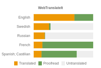
We now have new charts embeddable for just any project. Here’s mine:

You’ll find the new charts in your project settings, under “Goodies”.

Translation Resources is a new feature to fine-tune the content of your Translation Memory.

In the project settings, you’ll find 2 new settings under the “Translation Resources” tab.
Fine-tuneable Project Translation Memory
Your Project Translation Memory is now configurable.
Select the projects you want to re-use, and suggestions from these projects will be displayed as you translate.
Use another Term Base
We sometimes work on several projects having the same terminology: for instance a web app and a mobile app for the same company. And in this case we’d like to be able to reuse the Terminology Database from one project over to another.
You can now select the Term Base you want to use in the TermBase settings.
I hope you will find this new feature useful. Thank you for using WebTranslateIt.
There was a lot of chatter about Google closing its Google Translate API recently. In fact, Google won’t shut down their API but will turn it as a paying service on the first of December.
It doesn’t make a financial sense for me to keep supporting this API for all WebTranslateIt customers, so I decided to make this machine translation service optional, and to add another optional machine translation service: Bing Translator, which as this time, remains entirely free.
Setting up Google Translate and Bing Translator
Starting today, you won’t get any machine translation suggestions when you edit a segment. However, you will find in your project settings two new fields for your Google Translate API and Bing Translator API tokens.

This is really easy to set up:
- Go to your project settings.
- Scroll down to the “Machine Translation” section and get your API tokens using the links provided and paste them in the respective fields.
- Save your project settings, and that’s it!
Don’t hesitate to contact support if you have any troubles setting this up. Thank you for using WebTranslateIt.
Web Translate It will be unavailable for about 10 minutes tomorrow Saturday, October 8th, 10:00 CET as I move the service to our new host Softlayer.
Softlayer’s network and connectivity is entirely redundant and renown to be excellent. This will make Web Translate It’s website even more reliable and accessible to users.
UPDATE: We’ll postpone the server migration to another day, as I am stuck with last-minutes problems on the new server.
UPDATE2: Server problems are now sorted. I’ll reschedule the server migration on Sunday the 9th, 10AM CET.
I’m saddened to learn of Steve Jobs’ passing. He inspired generations of people to do great things. He certainly inspired me in what I do today.
Remembering that I’ll be dead soon is the most important tool I’ve ever encountered to help me make the big choices in life. Because almost everything — all external expectations, all pride, all fear of embarrassment or failure — these things just fall away in the face of death, leaving only what is truly important. Remembering that you are going to die is the best way I know to avoid the trap of thinking you have something to lose. You are already naked. There is no reason not to follow your heart.
Stay hungry, stay foolish.
I just released an update to WebTranslateIt’s API, which now accept two API keys for a project:
the usual private token, which authenticates read and write API endpoints,
a public token, which only authenticates read API endpoints.
Developers should use the new public token to develop features where the API token will be exposed (when developing a Javascript client for instance). You’ll find the new public token in your project settings.
Finally, WebTranslateIt now supports JSONP for all API endpoints. You will find more information about that in the API documentation.
Developer comments are instructions or help for translators left by developers in a locale file.
They are very different from regular comments. Comments are meant to be used for discussion, whereas developer comments as meant to be used for leaving a brief instruction to a translator.
When importing most language files, WebTranslateIt automatically extracts these developer comments and displays them in the translation interface, so they are visible to translators.

You can author or edit a developer comment from the web interface. Click on the “option” button, then “Details” (keyboard shortcut: press the d key after selecting a string).

A modal window appears and lets you type a comment. The length of a developer comment is limited to 140 characters to force you to keep your message short: these instructions should convey the idea quickly to translators.
Advanced features
Did you know you can upload and attach screenshots to developer comments to illustrate your comment? Use it to upload a screenshot of your app to show where a string is located, for instance.

Perhaps the killer feature is that developer comments are formatted using Markdown. The Markdown syntax allows you can create links, display images… the possibilities are almost limitless.

In this example, I used the markdown syntax to display an image inline.

Now, here’s real-life example: one of our users pushed the usefulness of this feature even further. They use WebTranslateIt to translate a list of products for an online shop pulled from their database. They wanted to convey more context to translators: how different is this shoe look compared to this other shoe?
They had the idea of programmatically format their developer comments so a small thumbnail representing their product is displayed on the translation interface for each string. Is there a better way to give context to a translator than that?

I just released a large update to WebTranslateIt’s translation suggestion system. What’s new?
Term Base Integration
Translation suggestions now integrate with the Term Base. What’s the Term Base? It’s a glossary of recurrent terms in your project. You can read more about it here.
When a term from your term base is detected, the translation interface will automatically pull its translation for you. Click on a term to copy the term to the textarea.

Adding terms to the term base can be a lot of work, but this integration makes it worth your time, as it really helps with translation consistency.
New translation suggestion algorithm
Prior to this upgrade, we used suggestions from Google Translate (ranked first), suggestions from translations from your own project, and suggestions from the Global Translation Memory (which contains translations coming from Projects which chose to contribute their translations to the system).
The new Translation Memory system use a more elaborate algorithm coupled with a ranking system.

The biggest difference with the previous algorithm is that it ranks suggestions better, and only uses Google Translate suggestions if the suggestions from WebTranslateIt have a bad ranking.
It is also able to pull out up to 20 different suggestions. By default we only display the 3 first translations, but you can see more by clicking on “view more suggestions”.
Feedback
I hope the new translation suggestion system works better for you. If you have feedback to share, don’t hesitate to let me know on the support website. Thank you for using WebTranslateIt!
I just released a new version of the web_translate_it gem, the open-source synchronization tool for Web Translate It.
This release brings one important speed improvement, as well as an important change in the configuration file.
Speed Improvements
This release use threads to download files. It means the tool can now download several files in parallel, which makes for faster syncs. The amount of threads used depends on the amount of files to download.
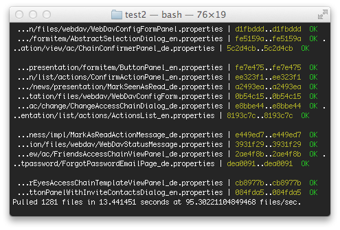
For instance this project contains 8 files. wti pull will use 3 threads and will pull 3.8 files per second.

This other project contains more than a thousand files. It used to take several minutes to sync. With the new wti client it now takes a few seconds. Here wti pull use 20 threads and pulls 96 files per second.

Configuration File change
I also changed the default configuration file name for this release.
The wti gem was originally designed as a Ruby on Rails plugin, so the default file name was config/translation.yml, as this is the default location where one put configuration files in Ruby on Rails.
The gem was downloaded more than 20K times, and is used to sync hundreds of projects developed many different languages, so this default location doesn’t make much sense now. The new configuration file location is now .wti at the root of your project.
You don’t have to change anything for this to work. The first time you use the new wti gem, it’ll propose you to migrate your configuration file automatically.

Install or Upgrade
To install web_translate_it, please refer to the gem documentation.
To upgrade web_translate_it to its latest version, type in a terminal: gem install web_translate_it.
I just released another improvement to the translation validation feature in Web Translate It.
The new translation validation system now checks whether line breaks in the translation text matches the ones in the source copy.
For instance, if the source copy contains a line break:

And we attempt to save a translation that contains no line break:

The improved translation validation feature now also checks whether spaces in the translation text match the ones in the source copy:


As usual, if you are sure your translation is correct, you can override the translation validation by unticking the “Perform validation checks” button before saving.
I hope you will find this improvement useful. Thank you for using WebTranslateIt.


